
96. Seaborn Data Visualization Basics#
96.1. Introduction#
Matplotlib is an open-source plotting library that supports the Python language. It is popular among various people such as Python engineers, scientific researchers, and data engineers because of its rich variety of plot types, simple plotting methods, and comprehensive interface documentation. Seaborn is a high-level plotting library centered around Matplotlib that can create more beautiful graphs without the need for complex customization, making it very suitable for data visualization exploration.
96.2. Key Points#
Relational plots
Categorical plots
Distribution plots
Regression plots
Matrix plots
Facet plots
96.3. Introduction to Seaborn#
Matplotlib is probably the best plotting library based on the Python language, but it also has a very troublesome problem, that is, it is too complex. With more than 3,000 pages of official documentation, thousands of methods, and tens of thousands of parameters, it is typical that you can do anything with it, but you don’t know where to start. Especially when you want to achieve very beautiful effects through Matplotlib, it often gives you a headache and is very troublesome.
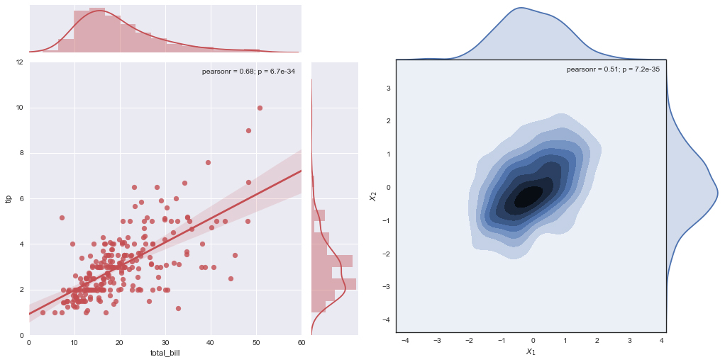
Seaborn performs a higher-level API encapsulation based on the core Matplotlib library, allowing you to easily draw more beautiful graphs. The beauty of Seaborn is mainly reflected in more comfortable color matching and more delicate styles of graphic elements. The following is a reference graph provided by the official Seaborn.
Seaborn has the following characteristics:
Built-in several optimized style effects.
-
Added palette tools for easily matching colors to data.
-
Simpler plotting of univariate and bivariate distributions, which can be used to compare subsets of data with each other.
-
More convenient regression fitting and visualization of independent and related variables.
-
Visualize data matrices and analyze them using clustering algorithms.
-
Plotting and statistical functions based on time series, with more flexible uncertainty estimation.
-
Draw more complex image collections based on grids.
In addition, Seaborn is highly compatible with the data structures of Matplotlib and Pandas, making it very suitable as a visualization tool in the data mining process.
96.4. Quick Graph Optimization#
When we use Matplotlib to draw graphs, the default graph style is not very aesthetically pleasing. At this time, Seaborn can be used to complete quick optimization. Below, let’s first use Matplotlib to draw a simple graph.
import matplotlib.pyplot as plt
%matplotlib inline

x = [1, 3, 5, 7, 9, 11, 13, 15, 17, 19]
y_bar = [3, 4, 6, 8, 9, 10, 9, 11, 7, 8]
y_line = [2, 3, 5, 7, 8, 9, 8, 10, 6, 7]

plt.bar(x, y_bar)
plt.plot(x, y_line, '-o', color='y')
[<matplotlib.lines.Line2D at 0x10f593a50>]

The method to quickly optimize graphs using Seaborn is very
simple. Just place the style declaration code
sns.set()
provided by Seaborn before drawing the graph.
import seaborn as sns

sns.set()  # 声明使用 Seaborn 样式

plt.bar(x, y_bar)
plt.plot(x, y_line, '-o', color='y')
[<matplotlib.lines.Line2D at 0x14f15b3d0>]

We can find that, compared with the pure white background default in Matplotlib, the light gray grid background default in Seaborn does look a bit more delicate and comfortable. Also, there are some changes in the color tone of the bar chart and the font size of the axes.
The default parameters of
sns.set()
are:
sns.set(context='notebook', style='darkgrid', palette='deep', font='sans-serif', font_scale=1, color_codes=False, rc=None)
Among them:
-
The
context=''parameter controls the default figure size, with four values:{paper, notebook, talk, poster}. Among them,poster > talk > notebook > paper. -
The
style=''parameter controls the default style, with values{darkgrid, whitegrid, dark, white, ticks}, and you can change them to see the differences among them. -
The
palette=''parameter is a preset color palette, with options such as{deep, muted, bright, pastel, dark, colorblind}, and you can change them to see the differences among them. -
The remaining
font=''is used to set the font,font_scale=sets the font size, andcolor_codes=does not use the color palette but uses previous color abbreviations such as'r'.
96.5. Seaborn Plotting API#
Seaborn has more than 50 API classes in total. Compared with the thousands of classes in Matplotlib, it can be regarded as concise. Among them, according to the applicable scenarios of the graphs, the plotting methods in Seaborn are roughly classified into 6 categories, namely: relational plots, categorical plots, distribution plots, regression plots, matrix plots, and composite plots. And there are different numbers of plotting functions under these 6 major categories.
Next, we will demonstrate by using actual data and use Seaborn to draw graphs for different applicable scenarios.
96.6. Relational Plots#
When we need to perform correlation analysis on data, we may use the following APIs provided by Seaborn.
|
Correlation Analysis |
Introduction |
|---|---|
relplot |
Draw a relational plot |
scatterplot |
Scatter plot for multi-dimensional analysis |
lineplot |
Line plot for multi-dimensional analysis |
relplot
is short for relational plots, which can be used to present
the relationships in data, mainly in two styles: scatter
plots and bar plots. In this experiment, we use the Iris
dataset for plotting exploration.
Before plotting, get familiar with the iris dataset. The dataset has a total of 150 rows and consists of 5 columns, representing sepal length, sepal width, petal length, petal width, and flower class respectively. Among them, the first four columns are all numerical data, and the last column, the flower classification, has three types: Iris Setosa, Iris Versicolour, and Iris Virginica.
# 从国内镜像下载 seaborn 数据集避免下一步加载数据集失败
!wget -nc "https://cdn.aibydoing.com/aibydoing/files/seaborn-data.zip"
!unzip seaborn-data.zip -d ~/
iris = sns.load_dataset("iris")
iris.head()
| sepal_length | sepal_width | petal_length | petal_width | species | |
|---|---|---|---|---|---|
| 0 | 5.1 | 3.5 | 1.4 | 0.2 | setosa |
| 1 | 4.9 | 3.0 | 1.4 | 0.2 | setosa |
| 2 | 4.7 | 3.2 | 1.3 | 0.2 | setosa |
| 3 | 4.6 | 3.1 | 1.5 | 0.2 | setosa |
| 4 | 5.0 | 3.6 | 1.4 | 0.2 | setosa |
At this time, we specify the features of \(x\) and \(y\), and by default, a scatter plot can be drawn.
sns.relplot(x="sepal_length", y="sepal_width", data=iris)
<seaborn.axisgrid.FacetGrid at 0x14f19b2d0>

However, the relationship between data categories cannot be seen from the above figure. It would be better if we add the category feature to color the data.
sns.relplot(x="sepal_length", y="sepal_width", hue="species", data=iris)
<seaborn.axisgrid.FacetGrid at 0x14f34ac50>

Functions in Seaborn have a large number of useful
parameters. For example, if we specify the
style
parameter, it can give different shapes to the scatter
points of different categories. For more parameters, I hope
you can learn about them by reading the official
documentation.
sns.relplot(x="sepal_length", y="sepal_width",
            hue="species", style="species", data=iris)
<seaborn.axisgrid.FacetGrid at 0x14f3d4510>

Not only scatter plots, but this method also supports line
plots, just by specifying the
kind="line"
parameter. Line plots and scatter plots are suitable for
different types of data. When drawing line plots, a 95%
confidence interval will also be automatically given.
sns.relplot(x="sepal_length", y="petal_length",
            hue="species", style="species", kind="line", data=iris)
<seaborn.axisgrid.FacetGrid at 0x14f4394d0>

You will find that we have mentioned 3 APIs above, namely:
relplot,
scatterplot
and
lineplot. In fact, you can regard the
relplot
we have practiced as a combined version of
scatterplot
and
lineplot.
Here we need to mention the concept of API hierarchy in
Seaborn. The APIs in Seaborn are divided into two types:
Figure-level and Axes-level.
relplot
is a Figure-level interface, while
scatterplot
and
lineplot
are Axes-level interfaces.
The difference between Figure-level and Axes-level APIs is that Axes-level functions can achieve a more flexible and closer integration with Matplotlib, while Figure-level is more like a “lazy function” and is suitable for quick applications.
For example, for the above figure, we can also use the
lineplot
function to draw it. You only need to remove the
kind
parameter in
relplot.
sns.lineplot(x="sepal_length", y="petal_length",
             hue="species", style="species", data=iris)
<Axes: xlabel='sepal_length', ylabel='petal_length'>

96.7. Categorical Plots#
Similar to relational plots, the Figure-level interface for
categorical plots is
catplot, which is an abbreviation for categorical plots. And
catplot
is actually a collection of the following Axes-level
plotting APIs:
-
Categorical scatter plots:
-
stripplot()(kind="strip") -
swarmplot()(kind="swarm")
-
-
Categorical distribution plots:
-
boxplot()(kind="box") -
violinplot()(kind="violin") -
boxenplot()(kind="boxen")
-
-
Categorical estimation plots:
-
pointplot()(kind="point") -
barplot()(kind="bar") -
countplot()(kind="count")
-
Next, let’s take a look at the plotting effect of
catplot. By default, this method plots a scatter plot with
kind="strip".
sns.catplot(x="sepal_length", y="species", data=iris)
<seaborn.axisgrid.FacetGrid at 0x14f368210>

kind="swarm"
can prevent the scatter points from overlapping in the
beeswarm style, making it easier to observe the data
distribution.
sns.catplot(x="sepal_length", y="species", kind="swarm", data=iris)
<seaborn.axisgrid.FacetGrid at 0x14f523b10>

Similarly, the
hue=
parameter can introduce another dimension to the plot. Since
the iris dataset only has one categorical column, we will
not add the
hue=
parameter here. If a dataset has multiple categories, the
hue=
parameter can make the data points better distinguishable.
Next, let’s try the plotting effects of several other types of graphs one by one. Plot a box plot:
sns.catplot(x="sepal_length", y="species", kind="box", data=iris)
<seaborn.axisgrid.FacetGrid at 0x14f670a90>

Plot a violin plot:
sns.catplot(x="sepal_length", y="species", kind="violin", data=iris)
<seaborn.axisgrid.FacetGrid at 0x14f70fa50>

Plot an enhanced box plot:
sns.catplot(x="species", y="sepal_length", kind="boxen", data=iris)
<seaborn.axisgrid.FacetGrid at 0x14f716a10>

Plot a point-line graph:
sns.catplot(x="sepal_length", y="species", kind="point", data=iris)
<seaborn.axisgrid.FacetGrid at 0x14f80a710>

Plot a bar chart:
sns.catplot(x="sepal_length", y="species", kind="bar", data=iris)
<seaborn.axisgrid.FacetGrid at 0x14f8c4690>

Plot a count bar chart:
sns.catplot(x="species", kind="count", data=iris)
<seaborn.axisgrid.FacetGrid at 0x14f913f90>

96.8. Distribution Map#
Distribution maps are mainly used to visualize the distribution of variables, generally divided into univariate distribution and multivariate distribution. Of course, here the multivariate mainly refers to binary variables, and it is impossible to draw an intuitive visualization graph for more variables.
The general methods for drawing distribution maps provided
by Seaborn are these:
jointplot,
pairplot,
distplot,
kdeplot. Next, let’s take a look at the usage of these plotting
methods one by one.
Seaborn’s quick way to view the univariate distribution is
distplot. By default, this method will draw a histogram and fit a
kernel density estimate plot.
sns.distplot(iris["sepal_length"])
<Axes: xlabel='sepal_length', ylabel='Density'>

distplot
provides parameters to adjust the histogram and kernel
density estimate plot. For example, setting
kde=False
can only draw the histogram, or
hist=False
can only draw the kernel density estimate plot. Of course,
kdeplot
can be specifically used to draw the kernel density estimate
plot, and its effect is the same as
distplot(hist=False), but
kdeplot
has more customization settings.
sns.kdeplot(iris["sepal_length"])
<Axes: xlabel='sepal_length', ylabel='Density'>

jointplot
is mainly used to draw the distribution map of binary
variables. For example, we explore the relationship between
the binary feature variables
sepal_length
and
sepal_width.
sns.jointplot(x="sepal_length", y="sepal_width", data=iris)
<seaborn.axisgrid.JointGrid at 0x14fac55d0>

jointplot
is not a Figure-level interface, but it supports the
kind=
parameter to specify different styles of distribution plots.
For example, draw a kernel density estimate comparison plot.
sns.jointplot(x="sepal_length", y="sepal_width", data=iris, kind="kde")
<seaborn.axisgrid.JointGrid at 0x14f1b2e10>

Hexbin plot:
sns.jointplot(x="sepal_length", y="sepal_width", data=iris, kind="hex")
<seaborn.axisgrid.JointGrid at 0x14fc23410>

Regression fit plot:
sns.jointplot(x="sepal_length", y="sepal_width", data=iris, kind="reg")
<seaborn.axisgrid.JointGrid at 0x14fd66d90>

Finally, the more powerful
pairplot
is introduced. It supports pairwise comparison and plotting
of feature variables in a dataset at once. By default,
univariate distribution plots are on the diagonal, while the
others are bivariate distribution plots.
sns.pairplot(iris)
<seaborn.axisgrid.PairGrid at 0x1568ba110>

At this time, it will be more intuitive to introduce the
third dimension
hue="species".
sns.pairplot(iris, hue="species")
<seaborn.axisgrid.PairGrid at 0x15705fd90>

96.9. Regression Plot#
Next, we continue to introduce regression plots. The main
functions for drawing regression plots are:
lmplot
and
regplot.
When using
regplot
to draw a regression plot, only the independent variable and
the dependent variable need to be specified, and
regplot
will automatically perform a linear regression fit.
sns.regplot(x="sepal_length", y="sepal_width", data=iris)
<Axes: xlabel='sepal_length', ylabel='sepal_width'>

lmplot
is also used to draw regression plots, but
lmplot
supports introducing a third dimension for comparison. For
example, we set
hue="species".
sns.lmplot(x="sepal_length", y="sepal_width", hue="species", data=iris)
<seaborn.axisgrid.FacetGrid at 0x168891f10>

96.10. Matrix Plot#
There are only 2 most commonly used ones in matrix plots,
namely:
heatmap
and
clustermap.
As the name implies,
heatmap
is mainly used to draw heatmaps.
import numpy as np

sns.heatmap(np.random.rand(10, 10))
<Axes: >

Heatmaps are very useful in certain scenarios, such as drawing heatmaps of variable correlation coefficients.
In addition,
clustermap
supports drawing the structure diagram of
hierarchical clustering. As shown below, we first remove the last target column in
the original dataset and then pass in the feature data. Of
course, you need to have some understanding of hierarchical
clustering, otherwise it will be very difficult to
understand the meaning expressed by the image.
iris.pop("species")
sns.clustermap(iris)
<seaborn.matrix.ClusterGrid at 0x168872550>

If you browse the official documentation, you will find that
there are also a large number of classes starting with
capital letters in Seaborn, such as
JointGrid,
PairGrid, etc. In fact, these classes are just further
encapsulations of their corresponding functions with
lowercase letters,
jointplot
and
pairplot. Of course, there may be slight differences between the
two, but there is no essential difference.
In addition, there are also introductions to some auxiliary components such as style control and color customization in the Seaborn official documentation. There is not much difficulty in applying these APIs. The key is to practice diligently.
96.11. Summary#
This chapter gives a brief introduction to the usage of Seaborn. Here, it is necessary to clarify the relationship between Seaborn and Matplotlib. Seaborn is not intended to replace Matplotlib, but should be regarded as a supplement to Matplotlib. For Matplotlib, it has highly customizable properties and can achieve any effect you want. While Seaborn is very simple and fast, and you can draw decent graphs with just a few lines of code. In short, Matplotlib is good at pure plotting, while Seaborn is mostly used for data visualization exploration.