
5. Polynomial Regression Implementation and Application#
5.1. Introduction#
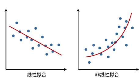
In the previous experiments, I believe you have already had a thorough understanding of linear regression. After mastering simple and multiple linear regression, we can perform regression predictions on some data with a linear distribution trend. However, in life, we often encounter some data that is not so “linear” in distribution, such as the fluctuations of the stock market and traffic flow. For such non-linearly distributed data, we need to use the methods introduced in this experiment to handle it.
5.2. Key Points#
Introduction to Polynomial Regression
Basics of Polynomial Regression
Polynomial Regression Prediction
5.3. Introduction to Polynomial Regression#
In linear regression, we fit the data by establishing a linear equation of the independent variable \(x\). In non-linear regression, however, we need to establish a non-linear relationship between the dependent variable and the independent variable. Intuitively speaking, that is, the fitted straight line becomes a “curve”.
For non-linear regression problems, the simplest and most common method is the “polynomial regression” to be explained in this experiment. Polynomials are concepts that we encounter in middle school. Here is the definition quoted from Wikipedia as follows:
A polynomial is a fundamental concept in algebra. It is an algebraic expression obtained by performing a finite number of addition, subtraction, multiplication, and exponentiation operations of natural numbers on variables called unknowns and constants called coefficients. A polynomial is a type of integral expression. A polynomial with only one unknown is called a univariate polynomial; for example, \(x^2 - 3x + 4\) is a univariate polynomial. A polynomial with more than one unknown is called a multivariate polynomial; for example, \(x^3 - 2xyz^2 + 2yz + 1\) is a trivariate polynomial.
5.4. Basics of Polynomial Regression#
First, let’s get to know polynomial regression through a set of example data.
# 加载示例数据
x = [4, 8, 12, 25, 32, 43, 58, 63, 69, 79]
y = [20, 33, 50, 56, 42, 31, 33, 46, 65, 75]
There are a total of 10 sets of example data, corresponding to the abscissa and ordinate respectively. Next, use Matplotlib to plot the data and view its trend of change.
from matplotlib import pyplot as plt

%matplotlib inline

plt.scatter(x, y)
<matplotlib.collections.PathCollection at 0x11ba8aa70>

5.5. Implementing Quadratic Polynomial Fitting#
Next, use a polynomial to fit the above scatter data. First, a standard univariate high-order polynomial function is as follows:
Among them, \(m\) represents the order of the polynomial, \(x^j\) represents the \(j\)-th power of \(x\), and \(w\) represents the coefficients of the polynomial.
When we use the above polynomial to fit the scatter points, two elements need to be determined, namely: the polynomial coefficients \(w\) and the polynomial order \(m\), which are also the two basic elements of the polynomial.
If the size of the polynomial order \(m\) is specified manually, then only the value of the polynomial coefficient \(w\) needs to be determined. For example, if \(m = 2\) is specified first here, the polynomial becomes:
When we determine the magnitude of the value of \(w\), we return to what we learned in linear regression before.
First, we construct two functions, namely the polynomial function for fitting and the error function.
def func(p, x):
    # 根据公式,定义 2 次多项式函数
    w0, w1, w2 = p
    f = w0 + w1 * x + w2 * x * x
    return f


def err_func(p, x, y):
    # 残差函数(观测值与拟合值之间的差距)
    ret = func(p, x) - y
    return ret
Next, it is the process of using the least squares method to solve for the optimal parameters. For convenience here, we directly use the least squares method class provided by Scipy to obtain the best fitting parameters. Of course, you can completely solve the parameters by yourself according to the least squares formula in the linear regression experiment. However, in actual work, for quick implementation, ready-made functions like Scipy are often used. Here, it is also to introduce another method to everyone.
import numpy as np
from scipy.optimize import leastsq

p_init = np.random.randn(3)  # 生成 3 个随机数
# 使用 Scipy 提供的最小二乘法函数得到最佳拟合参数
parameters = leastsq(err_func, p_init, args=(np.array(x), np.array(y)))

print("Fitting Parameters: ", parameters[0])
Fitting Parameters: [ 3.76893130e+01 -2.60474246e-01 8.00078197e-03]
Note
For the specific usage introduction of
scipy.optimize.leastsq(), you can read the
official documentation. It should be noted in particular that the
p_init
we defined above does not mean the initial parameters to
be minimized in the official documentation. Because the
least squares method is an analytical solution and does
not involve the process of iterating from a certain
parameter. In fact, the specific value of
p_init
here does not affect the solution result, so we used
random values, but the number of its values determines the
degree of the final polynomial. Specifically, if there are
\(n\)
values, then the finally solved polynomial is of degree
\(n - 1\).
The best fitting parameters
\(w_0\),
\(w_1\),
\(w_2\) we
obtained here are
3.76893117e+01,
-2.60474147e-01
and
8.00078082e-03
respectively. That is to say, the function after our fitting
(retaining two significant figures) is:
Then, we try to plot the fitted image.
# 绘制拟合图像时需要的临时点
x_temp = np.linspace(0, 80, 10000)

# 绘制拟合函数曲线
plt.plot(x_temp, func(parameters[0], x_temp), "r")

# 绘制原数据点
plt.scatter(x, y)
<matplotlib.collections.PathCollection at 0x10410ee00>

5.6. Implement Nth-degree Polynomial Fitting#
You will find that the result of the above quadratic polynomial fitting cannot properly reflect the changing trend of the scatter points. At this time, we can try cubic and higher-degree polynomial fittings. In the following code, we will make a slight modification to the code for the above quadratic polynomial fitting to implement a method for Nth-degree polynomial fitting.
def fit_func(p, x):
    """根据公式,定义 n 次多项式函数"""
    f = np.poly1d(p)
    return f(x)


def err_func(p, x, y):
    """残差函数(观测值与拟合值之间的差距)"""
    ret = fit_func(p, x) - y
    return ret


def n_poly(n):
    """n 次多项式拟合"""
    p_init = np.random.randn(n)  # 生成 n 个随机数
    parameters = leastsq(err_func, p_init, args=(np.array(x), np.array(y)))
    return parameters[0]
You can use \(n = 3\) (quadratic polynomial) to verify whether the above code works.
n_poly(3)
array([ 8.00077925e-03, -2.60474017e-01, 3.76893101e+01])
The parameter results obtained at this time are consistent
with the results of formula (3), except for the order. This
is because the default style of the polynomial function
np.poly1d(3)
in NumPy is:
Next, we plot the fitting results of polynomials of degrees 3, 4, 5, 6, 7, and 8.
# 绘制拟合图像时需要的临时点
x_temp = np.linspace(0, 80, 10000)

# 绘制子图
fig, axes = plt.subplots(2, 3, figsize=(15, 10))

axes[0, 0].plot(x_temp, fit_func(n_poly(4), x_temp), "r")
axes[0, 0].scatter(x, y)
axes[0, 0].set_title("m = 3")

axes[0, 1].plot(x_temp, fit_func(n_poly(5), x_temp), "r")
axes[0, 1].scatter(x, y)
axes[0, 1].set_title("m = 4")

axes[0, 2].plot(x_temp, fit_func(n_poly(6), x_temp), "r")
axes[0, 2].scatter(x, y)
axes[0, 2].set_title("m = 5")

axes[1, 0].plot(x_temp, fit_func(n_poly(7), x_temp), "r")
axes[1, 0].scatter(x, y)
axes[1, 0].set_title("m = 6")

axes[1, 1].plot(x_temp, fit_func(n_poly(8), x_temp), "r")
axes[1, 1].scatter(x, y)
axes[1, 1].set_title("m = 7")

axes[1, 2].plot(x_temp, fit_func(n_poly(9), x_temp), "r")
axes[1, 2].scatter(x, y)
axes[1, 2].set_title("m = 8")
Text(0.5, 1.0, 'm = 8')

As can be seen from the above six figures, when \(m = 4\) (quartic polynomial), the fitting effect of the image is significantly better than that of \(m = 3\). However, as the degree \(m\) increases, when \(m = 8\), the curve shows obvious oscillations, which is the overfitting phenomenon mentioned in the linear regression experiment.
5.7. Polynomial Fitting with scikit-learn#
In addition to defining polynomials and implementing the
polynomial regression fitting process by ourselves as above,
we can also use the polynomial regression method provided by
scikit-learn to complete it. Here, we will use the class
sklearn.preprocessing.PolynomialFeatures(). The main function of
PolynomialFeatures()
is to generate a polynomial feature matrix. If you are
exposed to this concept for the first time, you may need to
understand the following content carefully.
For a quadratic polynomial, we know its standard form is: \(y(x, w) = w_0 + w_1x + w_2x^2\). However, polynomial regression is equivalent to a special form of linear regression. For example, if we let \(x = x_1\) and \(x^2 = x_2\) here, then the original equation is transformed into: \(y(x, w) = w_0 + w_1x_1 + w_2x_2\), which becomes a multiple linear regression. This completes the transformation from a univariate high-degree polynomial to a multivariate first-degree polynomial. This is similar to the “substitution method” learned in high school mathematics.
For example, for the independent variable vector \(X\) and the dependent variable \(y\), if \(X\):
We can perform fitting through the linear regression model \(y = w_1x + w_0\). Similarly, for the univariate quadratic polynomial \(y(x, w) = w_0 + w_1x + w_2x^2\), if we can obtain the feature matrix composed of \(x = x_1\) and \(x^2 = x_2\), that is:
Then fitting can also be performed through linear regression.
You can calculate the above results manually, but when the polynomial is of high degree in one variable or multiple variables, the expression and calculation process of the feature matrix become relatively complex. For example, the following is the expression of the feature matrix for a binary quadratic polynomial.
Fortunately, in scikit-learn, we can automatically generate
the polynomial feature matrix through the
PolynomialFeatures()
class. The default parameters and common parameters of the
PolynomialFeatures()
class are defined as follows:
sklearn.preprocessing.PolynomialFeatures(degree=2, interaction_only=False, include_bias=True)
- degree: The degree of the polynomial, default is 2nd degree polynomial.
- interaction_only: Default is False. If True, it generates the interaction feature set.
- include_bias: Default is True, includes the intercept term in the polynomial.
For the above feature vector, the main function of using
PolynomialFeatures()
is to generate the feature matrix corresponding to the 2nd
degree polynomial, as shown below:
from sklearn.preprocessing import PolynomialFeatures

X = [2, -1, 3]
X_reshape = np.array(X).reshape(len(X), 1)  # 转换为列向量
# 使用 PolynomialFeatures 自动生成特征矩阵
PolynomialFeatures(degree=2, include_bias=False).fit_transform(X_reshape)
array([[ 2.,  4.],
       [-1.,  1.],
       [ 3.,  9.]])
For the matrix in the above cell, the first column is \(X^1\) and the second column is \(X^2\). We can then fit the data using the multiple linear equation \(y(x, w) = w_0 + w_1x_1 + w_2x_2\).
{note}
In this section of the course, you will see a lot of `reshape` operations, and their purpose is to meet the array shapes required by certain classes or functions for passing arguments. These operations are necessary in this experiment because the original shape of the data (such as the one-dimensional array above) may not be directly passed into certain specific classes or functions. However, in actual work, it is not necessary because the shape of the original dataset in your hand may support direct passing. Therefore, don't be confused by these `reshape` operations, and don't try to memorize them by rote.
For the example data in the previous section, the
independent variable should be
\(x\), and
the dependent variable is
\(y\). If
we use a 2nd degree polynomial for fitting, then we first
use
PolynomialFeatures()
to obtain the feature matrix.
x = np.array(x).reshape(len(x), 1)  # 转换为列向量
y = np.array(y).reshape(len(y), 1)

# 使用 sklearn 得到 2 次多项式回归特征矩阵
poly_features = PolynomialFeatures(degree=2, include_bias=False)
poly_x = poly_features.fit_transform(x)

poly_x
array([[4.000e+00, 1.600e+01],
       [8.000e+00, 6.400e+01],
       [1.200e+01, 1.440e+02],
       [2.500e+01, 6.250e+02],
       [3.200e+01, 1.024e+03],
       [4.300e+01, 1.849e+03],
       [5.800e+01, 3.364e+03],
       [6.300e+01, 3.969e+03],
       [6.900e+01, 4.761e+03],
       [7.900e+01, 6.241e+03]])
As can be seen, the output result exactly corresponds to the formula for the feature matrix of the univariate quadratic polynomial \(\left [ X, X^2 \right ]\). Then, we use scikit-learn to train a linear regression model.
from sklearn.linear_model import LinearRegression

# 定义线性回归模型
model = LinearRegression()
model.fit(poly_x, y)  # 训练

# 得到模型拟合参数
model.intercept_, model.coef_
(array([37.68931083]), array([[-0.26047408, 0.00800078]]))
You will find that the parameter values obtained here are consistent with the formula \((3, 4)\). For a more intuitive view, the fitted graph is also plotted here.
# 绘制拟合图像
x_temp = np.array(x_temp).reshape(len(x_temp), 1)
poly_x_temp = poly_features.fit_transform(x_temp)

plt.plot(x_temp, model.predict(poly_x_temp), "r")
plt.scatter(x, y)
<matplotlib.collections.PathCollection at 0x1277931f0>
You will find that the above figure looks familiar. It is actually the same as the figure below formula \((3)\).
5.8. Polynomial Regression Prediction#
In the above content, we learned how to use polynomials to fit data. Then, in the following content, we will use polynomial regression to solve practical prediction problems. In this prediction experiment, we use the “World Measles Vaccination Coverage” dataset provided by the World Health Organization and the United Nations Children’s Fund. The goal is to predict the measles vaccination coverage for the corresponding year.
First, we import and preview the “World Measles Vaccination Coverage” dataset.
wget -nc https://cdn.aibydoing.com/aibydoing/files/course-6-vaccine.csv
import pandas as pd

# 加载数据集
df = pd.read_csv("course-6-vaccine.csv",header=0)
df
| Year | Values | |
|---|---|---|
| 0 | 1983 | 48.676809 |
| 1 | 1984 | 50.653151 |
| 2 | 1985 | 45.603729 |
| 3 | 1986 | 45.511160 |
| 4 | 1987 | 52.882892 |
| 5 | 1988 | 62.710162 |
| 6 | 1989 | 68.354736 |
| 7 | 1990 | 73.618808 |
| 8 | 1991 | 69.748838 |
| 9 | 1992 | 69.905091 |
| 10 | 1993 | 70.517807 |
| 11 | 1994 | 62.019265 |
| 12 | 1995 | 73.887410 |
| 13 | 1996 | 73.376443 |
| 14 | 1997 | 75.599240 |
| 15 | 1998 | 71.236410 |
| 16 | 1999 | 70.783087 |
| 17 | 2000 | 72.381822 |
| 18 | 2001 | 74.997859 |
| 19 | 2002 | 72.610008 |
| 20 | 2003 | 80.104407 |
| 21 | 2004 | 75.126596 |
| 22 | 2005 | 72.750992 |
| 23 | 2006 | 85.550532 |
| 24 | 2007 | 82.033782 |
| 25 | 2008 | 76.587843 |
| 26 | 2009 | 82.602683 |
| 27 | 2010 | 80.786124 |
| 28 | 2011 | 78.931800 |
| 29 | 2012 | 83.456979 |
| 30 | 2013 | 85.124059 |
| 31 | 2014 | 87.375816 |
| 32 | 2015 | 82.704588 |
| 33 | 2016 | 85.898262 |
It can be seen that this dataset consists of two columns. Among them, Year represents the year, and Values represents the world measles vaccination coverage in that year. Here, only the numerical part of the percentage is taken. We plot the data into a chart to view the changing trend.
# 定义 x, y 的取值
x = df["Year"]
y = df["Values"]
# 绘图
plt.plot(x, y, "r")
plt.scatter(x, y)
<matplotlib.collections.PathCollection at 0x145e00880>

Regarding the changing trend presented in the above figure, we might think that polynomial regression would be superior to linear regression. Is that really the case? Let’s give it a try and find out.
5.9. Comparison between Linear Regression and Quadratic Polynomial Regression#
According to what we learned in the linear regression course, in machine learning tasks, we generally divide the dataset into a training set and a test set. Therefore, here 70% of the data is divided into the training set, while the other 30% is classified as the test set. The code is as follows:
# 首先划分 dateframe 为训练集和测试集
train_df = df[: int(len(df) * 0.7)]
test_df = df[int(len(df) * 0.7) :]

# 定义训练和测试使用的自变量和因变量
X_train = train_df["Year"].values
y_train = train_df["Values"].values

X_test = test_df["Year"].values
y_test = test_df["Values"].values
Next, we use the polynomial regression prediction method provided by scikit-learn to train the model. First, we solve the above problem, that is: Will polynomial regression be superior to linear regression?
First, train a linear regression model and make predictions.
# 建立线性回归模型
model = LinearRegression()
model.fit(X_train.reshape(len(X_train), 1), y_train.reshape(len(y_train), 1))
results = model.predict(X_test.reshape(len(X_test), 1))
results  # 线性回归模型在测试集上的预测结果
array([[81.83437635],
       [83.09935437],
       [84.36433239],
       [85.62931041],
       [86.89428843],
       [88.15926645],
       [89.42424447],
       [90.68922249],
       [91.95420051],
       [93.21917853],
       [94.48415655]])
With the prediction results, we can compare them with the actual results. Here, we use two metrics: mean absolute error and mean squared error. If you are still not very familiar with these two metrics, their definitions are as follows:
The mean absolute error (MAE) is the average of the absolute errors, and its calculation formula \((6)\) is as follows:
Among them, \(y_{i}\) represents the true value, \(\hat y_{i}\) represents the predicted value, and \(n\) represents the number of values. The smaller the value of MAE, the better the accuracy of the prediction model.
The mean squared error (MSE) represents the expected value of the square of the error, and its calculation formula \((7)\) is as follows:
Among them, \(y_{i}\) represents the true value, \(\hat{y}_{i}\) represents the predicted value, and \(n\) represents the number of values. The smaller the value of MSE, the better the accuracy of the prediction model.
Here, we directly use the MAE and MSE calculation methods provided by scikit-learn.
from sklearn.metrics import mean_absolute_error
from sklearn.metrics import mean_squared_error

print("线性回归平均绝对误差: ", mean_absolute_error(y_test, results.flatten()))
print("线性回归均方误差: ", mean_squared_error(y_test, results.flatten()))
线性回归平均绝对误差:  6.011979515629812
线性回归均方误差:  43.531858295153434
Next, start training a second-degree polynomial regression model and make predictions.
# 2 次多项式回归特征矩阵
poly_features_2 = PolynomialFeatures(degree=2, include_bias=False)
poly_X_train_2 = poly_features_2.fit_transform(X_train.reshape(len(X_train), 1))
poly_X_test_2 = poly_features_2.fit_transform(X_test.reshape(len(X_test), 1))

# 2 次多项式回归模型训练与预测
model = LinearRegression()
model.fit(poly_X_train_2, y_train.reshape(len(X_train), 1))  # 训练模型

results_2 = model.predict(poly_X_test_2)  # 预测结果

results_2.flatten()  # 打印扁平化后的预测结果
array([71.98010746, 70.78151826, 69.38584368, 67.79308372, 66.00323838,
       64.01630767, 61.83229158, 59.45119011, 56.87300326, 54.09773104,
       51.12537344])
print("2 次多项式回归平均绝对误差: ", mean_absolute_error(y_test, results_2.flatten()))
print("2 次多项式均方误差: ", mean_squared_error(y_test, results_2.flatten()))
2 次多项式回归平均绝对误差:  19.792070829572946
2 次多项式均方误差:  464.32903847534686
According to the definitions of the mean absolute error and the mean squared error above, you already know that the smaller these two values are, the higher the prediction accuracy of the model. That is to say, the prediction result of the linear regression model is better than that of the second-degree polynomial regression model.
5.10. Higher-degree Polynomial Regression Prediction#
Don’t be surprised. This situation is very common. But this doesn’t mean that the polynomial regression described in this experiment is worse than linear regression. Next, let’s try the results of 3rd, 4th, and 5th-degree polynomial regressions. To reduce the amount of code, we refactor the code and obtain the prediction results of the three experiments at once.
Here, by instantiating the
make_pipeline
pipeline class, it is possible to apply it to all predictors
by calling the
fit
and
predict
methods once.
make_pipeline
is an innovative technique in the process of using sklearn,
which can encapsulate a processing flow for use.
Specifically, for example, in the polynomial regression
above, we need to first use
PolynomialFeatures
to complete the transformation of the feature matrix and
then put it into
LinearRegression. Then, the processing flow of
PolynomialFeatures
                      +
                      LinearRegression
can be encapsulated and used through
make_pipeline.
from sklearn.pipeline import make_pipeline

X_train = X_train.reshape(len(X_train), 1)
X_test = X_test.reshape(len(X_test), 1)
y_train = y_train.reshape(len(y_train), 1)

for m in [3, 4, 5]:
    model = make_pipeline(PolynomialFeatures(m, include_bias=False), LinearRegression())
    model.fit(X_train, y_train)
    pre_y = model.predict(X_test)
    print("{} 次多项式回归平均绝对误差: ".format(m), mean_absolute_error(y_test, pre_y.flatten()))
    print("{} 次多项式均方误差: ".format(m), mean_squared_error(y_test, pre_y.flatten()))
    print("---")
3 次多项式回归平均绝对误差:  4.547692030677687
3 次多项式均方误差:  29.933057420285273
---
4 次多项式回归平均绝对误差:  4.424398084402177
4 次多项式均方误差:  29.02940070116114
---
5 次多项式回归平均绝对误差:  4.341616857646972
5 次多项式均方误差:  28.221932647958223
---
From the above results, it can be concluded that the results of 3rd, 4th, and 5th-degree polynomial regressions are all better than the linear regression model. Therefore, polynomial regression still has its advantages.
{note}
For a deeper understanding of the usage of `make_pipeline`, you can read the [official documentation](http://scikit-learn.org/stable/modules/generated/sklearn.pipeline.make_pipeline.html), or a good [article](https://blog.csdn.net/lanchunhui/article/details/50521648).
5.11. Polynomial Regression Prediction Degree Selection#
Up to this point in the experiment, you may have a question: In the process of selecting a polynomial for regression prediction, which degree of polynomial is the best?
For the above question, the answer is actually very simple. We can choose an error metric, such as MSE here, and then calculate the graph of how this metric changes as the degree of the polynomial increases. Won’t the result be obvious at a glance? Have a try.
# 计算 m 次多项式回归预测结果的 MSE 评价指标并绘图
mse = []  # 用于存储各最高次多项式 MSE 值
m = 1  # 初始 m 值
m_max = 10  # 设定最高次数
while m <= m_max:
    model = make_pipeline(PolynomialFeatures(m, include_bias=False), LinearRegression())
    model.fit(X_train, y_train)  # 训练模型
    pre_y = model.predict(X_test)  # 测试模型
    mse.append(mean_squared_error(y_test, pre_y.flatten()))  # 计算 MSE
    m = m + 1

print("MSE 计算结果: ", mse)
# 绘图
plt.plot([i for i in range(1, m_max + 1)], mse, "r")
plt.scatter([i for i in range(1, m_max + 1)], mse)

# 绘制图名称等
plt.title("MSE of m degree of polynomial regression")
plt.xlabel("m")
plt.ylabel("MSE")
MSE 计算结果: [43.531858295153434, 464.32903847534686, 29.933057420285273, 29.02940070116114, 28.221932647958223, 27.440821643005446, 26.712320051116773, 26.038729592942772, 25.422418053695605, 24.86581840902298]
Text(0, 0.5, 'MSE')

As shown in the figure above, the MSE value reaches its peak in the quadratic polynomial regression prediction and then drops rapidly. Although the results after the cubic polynomial still show a gradually decreasing trend, they tend to level off. Generally, considering the generalization ability of the model and avoiding overfitting, we can choose the cubic polynomial as the optimal regression prediction model here.
5.12. Summary#
In this experiment, we learned what polynomial regression is, as well as the connections and differences between polynomial regression and linear regression. Meanwhile, the experiment explored the hands-on implementation of polynomial regression fitting and the construction of a polynomial regression prediction model using scikit-learn on a real dataset.
Related Links