94. Matplotlib 2D Image Plotting Methods#
94.1. Introduction#
Matplotlib is an open-source plotting library that supports the Python language. It is popular among various people such as Python engineers, scientific researchers, and data engineers because of its rich variety of supported plot types, simple plotting methods, and comprehensive interface documentation. In this experiment, we will learn the methods and techniques of using Matplotlib for plotting.
94.2. Key Points#
2D graph plotting
Subplots and combined graphs
Compatibility with MATLAB-style API

In the process of using machine learning methods to solve problems, there will definitely be scenarios where we need to plot data. Matplotlib is an open-source plotting library that supports the Python language. It is popular among various people such as Python engineers, scientific researchers, and data engineers because of its rich variety of supported plot types, simple plotting methods, and comprehensive interface documentation. Matplotlib has a very active community and stable version iterations. When we are taking machine learning courses, mastering the use of Matplotlib is undoubtedly one of the most important preparatory tasks.
When plotting in a Notebook environment, you need to first
run the magic command
%matplotlib
                      inline
of Jupyter Notebook. The function of this command is to
embed the graphs plotted by Matplotlib in the current page.
When plotting in a desktop environment, this command is not
needed. Instead, append
plt.show()
after all the plotting code.
%matplotlib inline
94.3. Simple Graph Plotting#
When using the object-oriented API provided by Matplotlib,
you need to import the
pyplot
module and abbreviate it as
plt
by convention.
from matplotlib import pyplot as plt
As we all said, Matplotlib is a very simple and complete open-source plotting library. So just how simple is it? Next, we will plot a simple line chart with 1 line of code.
plt.plot([1, 2, 3, 2, 1, 2, 3, 4, 5, 6, 5, 4, 3, 2, 1])
[<matplotlib.lines.Line2D at 0x11bf241d0>]

As can be seen, a line chart similar to the shape of a mountain peak is plotted.
Previously, we imported the
pyplot
plotting module from Matplotlib and abbreviated it as
plt. The
pyplot
module is the core module of Matplotlib, and almost all 2D
graphics of various styles are drawn through this module.
Abbreviating it as
plt
here is a common convention, and I hope you will also write
your code like this for better readability.
plt.plot()
is a method class for drawing lines (line charts) under the
pyplot
module. The example contains a list
[1, 2,
                      3, 2,
                      1, 2,
                      3, 4,
                      5, 6,
                      5, 4,
                      3, 2,
                      1]
. Matplotlib will default to using this list as the
\(y\)
values, and the
\(x\)
values will start from 0 and increase sequentially.
Of course, if you need to customize the x-axis values, you only need to pass in two lists. As shown in the following code, we customize the x-axis tick marks to start from 2.
plt.plot([2, 3, 4, 5, 6, 7, 8, 9, 10, 11, 12, 13, 14, 15, 16],
         [1, 2, 3, 2, 1, 2, 3, 4, 5, 6, 5, 4, 3, 2, 1])
[<matplotlib.lines.Line2D at 0x11c047690>]

The above demonstrated how to draw a simple line chart. Well, in addition to line charts, we usually also need to draw bar charts, scatter plots, pie charts, and so on. How should these charts be drawn?
The
pyplot.plot
method in the
pyplot
module is used to draw line charts. You should easily
associate that changing the method class name behind can
change the style of the graph. Indeed, in Matplotlib, the
drawing methods for most graph styles exist in the
pyplot
module. For example:
Method |
Meaning |
|---|---|
|
|
Draw an electronic wave spectrum diagram |
|
|
Draw a bar chart |
|
|
Draw a histogram |
|
|
Draw a horizontal histogram |
|
|
Draw a contour plot |
|
|
Draw error bars |
|
|
Draw a hexagonal pattern |
|
|
Draw a bar graph |
|
|
Draw a horizontal bar graph |
|
|
Draw a pie chart |
|
|
Draw a vector field diagram |
|
|
Scatter plot |
|
|
Draw a spectrogram |
Next, we refer to the drawing method of the line chart and try to draw several simple graphs.
The
matplotlib.pyplot.plot(*args,
                      **kwargs)
method, strictly speaking, can draw line graphs or sample
markers. Among them,
*args
allows input of a single
\(y\)
value or
\(x, y\)
values.
For example, here we draw a sine curve graph with custom \(x\) and \(y\).
import numpy as np  # 载入数值计算模块

# 在 -2PI 和 2PI 之间等间距生成 1000 个值,也就是 X 坐标
X = np.linspace(-2*np.pi, 2*np.pi, 1000)
# 计算 y 坐标
y = np.sin(X)

# 向方法中 `*args` 输入 X,y 坐标
plt.plot(X, y)
[<matplotlib.lines.Line2D at 0x11c08df90>]

The sine curve is drawn. However, it should be noted that
the sine curve drawn by
pyplot.plot
here is not actually a curve graph in the strict sense, and
it is still a straight line between two points. It looks
like a curve here because the sample points are very close
to each other.
Everyone should be very familiar with the bar chart
matplotlib.pyplot.bar(*args,
                      **kwargs)
. Here, we directly use the above code and just change
plt.plot(X,
                      y)
to
plt.bar(X,
                      y)
to give it a try.
plt.bar([1, 2, 3], [1, 2, 3])
<BarContainer object of 3 artists>

The scatter plot
matplotlib.pyplot.scatter(*args,
                      **kwargs)
consists of some points presented on a two-dimensional
plane, and this type of graph is also very commonly needed.
For example, the data points collected by GPS, which contain
two values, longitude and latitude, can be plotted as a
scatter plot in such cases.
# X,y 的坐标均有 numpy 在 0 到 1 中随机生成 1000 个值
X = np.random.ranf(1000)
y = np.random.ranf(1000)
# 向方法中 `*args` 输入 X,y 坐标
plt.scatter(X, y)
<matplotlib.collections.PathCollection at 0x11c1aa890>

The pie chart
matplotlib.pyplot.pie(*args,
                      **kwargs)
is especially useful when presenting a finite list as
percentages. You can clearly see the size relationships
between different categories and the proportion of each
category in the whole.
plt.pie([1, 2, 3, 4, 5])
([<matplotlib.patches.Wedge at 0x11c247350>,
  <matplotlib.patches.Wedge at 0x109ba42d0>,
  <matplotlib.patches.Wedge at 0x11c26a250>,
  <matplotlib.patches.Wedge at 0x11c26b5d0>,
  <matplotlib.patches.Wedge at 0x11c270b10>],
 [Text(1.075962358309037, 0.22870287165240302, ''),
  Text(0.7360436312779136, 0.817459340184711, ''),
  Text(-0.33991877217145816, 1.046162142464278, ''),
  Text(-1.0759623315431446, -0.2287029975759841, ''),
  Text(0.5500001932481627, -0.9526278325909778, '')])

The vector field plot
matplotlib.pyplot.quiver(*args,
                      **kwargs)
is a graph composed of vectors and is widely used in
meteorology and other fields. From the perspective of the
graph, the vector field plot is a directional arrow symbol.
X, y = np.mgrid[0:10, 0:10]
plt.quiver(X, y)
<matplotlib.quiver.Quiver at 0x11b74ea10>

When we studied geography in middle school, we already knew
about contour lines. The contour plot
matplotlib.pyplot.contourf(*args,
                      **kwargs)
is a type of graph often encountered in the engineering
field, and its drawing process is a bit more complex.
# 生成网格矩阵
x = np.linspace(-5, 5, 500)
y = np.linspace(-5, 5, 500)
X, Y = np.meshgrid(x, y)
# 等高线计算公式
Z = (1 - X / 2 + X ** 3 + Y ** 4) * np.exp(-X ** 2 - Y ** 2)

plt.contourf(X, Y, Z)
<matplotlib.contour.QuadContourSet at 0x11c148b10>

94.4. Define Graph Styles#
Above, we plotted simple basic graphs, but none of them are aesthetically pleasing. You can make the graphs look more beautiful with more parameters.
We already know that line graphs are plotted using the
matplotlib.pyplot.plot(*args,
                      **kwargs)
method. Among them,
args
represents the data input, and the
kwargs
part is used to set the style parameters.
There are more than 40 parameters for two-dimensional line graphs listed here, and more than 10 of them are commonly used. Some of the more representative parameters are listed below:
Parameter |
Meaning |
|---|---|
|
|
Set the transparency of the line style, from 0.0 to 1.0 |
|
|
Set the color of the line style |
|
|
Set the filling style of the line style |
|
|
Set the style of the line style |
|
|
Set the width of the line style |
|
|
Set the style of the marker points |
…… |
…… |
As for the setting options included in each parameter, you need to learn about them in detail through the official documentation.
Next, let’s redraw a trigonometric function graph.
# 在 -2PI 和 2PI 之间等间距生成 1000 个值,也就是 X 坐标
X = np.linspace(-2 * np.pi, 2 * np.pi, 1000)
# 计算 sin() 对应的纵坐标
y1 = np.sin(X)
# 计算 cos() 对应的纵坐标
y2 = np.cos(X)

# 向方法中 `*args` 输入 X,y 坐标
plt.plot(X, y1, color='r', linestyle='--', linewidth=2, alpha=0.8)
plt.plot(X, y2, color='b', linestyle='-', linewidth=2)
[<matplotlib.lines.Line2D at 0x11c3aa290>]

Scatter plots are similar. Many of their style parameters are more or less the same, and you need to read the official documentation for a detailed understanding.
Parameter |
Meaning |
|---|---|
|
|
Size of the scatter points |
|
|
Color of the scatter points |
|
|
Style of the scatter points |
|
|
Define the colors for multi - category scatter points |
|
|
Transparency of the points |
|
|
Color of the edges of the scatter points |
# 生成随机数据
x = np.random.rand(100)
y = np.random.rand(100)
colors = np.random.rand(100)
size = np.random.normal(50, 60, 100)

plt.scatter(x, y, s=size, c=colors)  # 绘制散点图
<matplotlib.collections.PathCollection at 0x11c1d0cd0>

Pie charts are drawn using
matplotlib.pyplot.pie(). We can also further set various styles such as its color,
labels, shadows, etc. Here is an example drawn below.
label = 'Cat', 'Dog', 'Cattle', 'Sheep', 'Horse'  # 各类别标签
color = 'r', 'g', 'r', 'g', 'y'  # 各类别颜色
size = [1, 2, 3, 4, 5]  # 各类别占比
explode = (0, 0, 0, 0, 0.2)  # 各类别的偏移半径
# 绘制饼状图
plt.pie(size, colors=color, explode=explode,
        labels=label, shadow=True, autopct='%1.1f%%')
# 饼状图呈正圆
plt.axis('equal')
(-1.1049993056205831,
 1.2050000037434874,
 -1.2818649333716365,
 1.1086522704404567)

94.5. Combined Graph Styles#
The above demonstrated the drawing of a single simple graph. In fact, we often encounter the situation of displaying several graphs of the same type on one graph, that is, the drawing of a combined graph. It’s actually very simple. You just need to place the codes of the required graphs together. For example, to draw a combined graph containing a bar graph and a line graph.
x = [1, 3, 5, 7, 9, 11, 13, 15, 17, 19]
y_bar = [3, 4, 6, 8, 9, 10, 9, 11, 7, 8]
y_line = [2, 3, 5, 7, 8, 9, 8, 10, 6, 7]

plt.bar(x, y_bar)
plt.plot(x, y_line, '-o', color='y')
[<matplotlib.lines.Line2D at 0x11c563690>]

Of course, not any codes placed together will result in a combined graph. Above, the x - coordinates of the two graphs must be shared in order for Matplotlib to automatically recognize it as a combined graph effect.
94.6. Define Graph Positions#
During the process of graph drawing, you may need to adjust
the position of the graph or piece together several
individual graphs. At this time, we need to introduce the
plt.figure
graph object.
Next, let’s draw a graph with a custom position.
x = np.linspace(0, 10, 20)  # 生成数据
y = x * x + 2

fig = plt.figure()  # 新建图形对象
axes = fig.add_axes([0.5, 0.5, 0.8, 0.8])  # 控制画布的左, 下, 宽度, 高度
axes.plot(x, y, 'r')
[<matplotlib.lines.Line2D at 0x11c613690>]

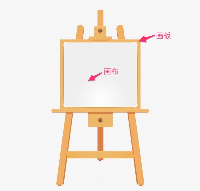
In the above plotting code, you may have questions about
figure
and
axes. The API of Matplotlib is designed very reasonably. Here,
figure
is equivalent to the drawing board for painting, while
axes
is equivalent to the canvas laid on the drawing board. We
draw the image on the canvas, and thus we have operations
such as
plot
and
set_xlabel.
With the help of the graph object, we can achieve the effect of a large graph containing a small graph.
fig = plt.figure()  # 新建画板
axes1 = fig.add_axes([0.1, 0.1, 0.8, 0.8])  # 大画布
axes2 = fig.add_axes([0.2, 0.5, 0.4, 0.3])  # 小画布

axes1.plot(x, y, 'r')  # 大画布
axes2.plot(y, x, 'g')  # 小画布
[<matplotlib.lines.Line2D at 0x11c711690>]

In the above plotting code, you have learned to use the
add_axes()
method to add the canvas
axes
to the drawing board
figure
we set. In Matplotlib, there is another way to add a canvas,
which is
plt.subplots(), and both it and
axes
are equivalent to the canvas.
fig, axes = plt.subplots()
axes.plot(x, y, 'r')
[<matplotlib.lines.Line2D at 0x11c532490>]

With the help of
plt.subplots(), we can draw subplots, that is, stitch multiple plots
together in a certain order.
fig, axes = plt.subplots(nrows=1, ncols=2)  # 子图为 1 行,2 列
for ax in axes:
    ax.plot(x, y, 'r')

By setting the parameters of
plt.subplots, it is possible to adjust the canvas size and display
precision.
fig, axes = plt.subplots(
    figsize=(16, 9), dpi=50)  # 通过 figsize 调节尺寸, dpi 调节显示精度
axes.plot(x, y, 'r')
[<matplotlib.lines.Line2D at 0x11c751ad0>]

94.7. Standard Plotting Methods#
Above, we have got started with the plotting methods of Matplotlib. Due to the flexibility of Matplotlib, many methods can be used to draw graphs. However, to avoid the problem of “drawing however one wants”, we need to agree on a set of relatively standard plotting methods according to our own habits.
First of all, for the drawing of any graph, it is
recommended to manage a complete graph object through
plt.figure()
or
plt.subplots(), rather than simply using a single statement such as
plt.plot(...)
to draw the graph.
Managing a complete graph object has many benefits. Based on the graph, it leaves a lot of room for adding legends, graph styles, annotations, etc. later. In addition, the code looks more standardized and is more readable.
Next, we will demonstrate the standard plotting methods through several sets of examples.
94.8. Add Plot Title and Legend#
Examples of plotting a graph with a plot title, axis titles, and a legend are as follows:
fig, axes = plt.subplots()

axes.set_xlabel('x label')  # 横轴名称
axes.set_ylabel('y label')
axes.set_title('title')  # 图形名称

axes.plot(x, x**2)
axes.plot(x, x**3)
axes.legend(["y = x**2", "y = x**3"], loc=0)  # 图例
<matplotlib.legend.Legend at 0x11c59af10>

The
loc
parameter in the legend marks the position of the legend.
The numbers
1, 2,
                      3,
                      4
represent the upper right corner, upper left corner, lower
left corner, and lower right corner respectively;
0
represents automatic adaptation.
94.9. Line Style, Color, Transparency#
In Matplotlib, you can set other properties such as the color and transparency of the line.
fig, axes = plt.subplots()

axes.plot(x, x+1, color="red", alpha=0.5)
axes.plot(x, x+2, color="#1155dd")
axes.plot(x, x+3, color="#15cc55")
[<matplotlib.lines.Line2D at 0x11c946650>]

For line styles, in addition to solid lines and dashed lines, there are many other rich line styles to choose from.
fig, ax = plt.subplots(figsize=(12, 6))

# 线宽
ax.plot(x, x+1, color="blue", linewidth=0.25)
ax.plot(x, x+2, color="blue", linewidth=0.50)
ax.plot(x, x+3, color="blue", linewidth=1.00)
ax.plot(x, x+4, color="blue", linewidth=2.00)

# 虚线类型
ax.plot(x, x+5, color="red", lw=2, linestyle='-')
ax.plot(x, x+6, color="red", lw=2, ls='-.')
ax.plot(x, x+7, color="red", lw=2, ls=':')

# 虚线交错宽度
line, = ax.plot(x, x+8, color="black", lw=1.50)
line.set_dashes([5, 10, 15, 10])

# 符号
ax.plot(x, x + 9, color="green", lw=2, ls='--', marker='+')
ax.plot(x, x+10, color="green", lw=2, ls='--', marker='o')
ax.plot(x, x+11, color="green", lw=2, ls='--', marker='s')
ax.plot(x, x+12, color="green", lw=2, ls='--', marker='1')

# 符号大小和颜色
ax.plot(x, x+13, color="purple", lw=1, ls='-', marker='o', markersize=2)
ax.plot(x, x+14, color="purple", lw=1, ls='-', marker='o', markersize=4)
ax.plot(x, x+15, color="purple", lw=1, ls='-',
        marker='o', markersize=8, markerfacecolor="red")
ax.plot(x, x+16, color="purple", lw=1, ls='-', marker='s', markersize=8,
        markerfacecolor="yellow", markeredgewidth=2, markeredgecolor="blue")
[<matplotlib.lines.Line2D at 0x11c9fa790>]

94.10. Canvas Grid, Axis Range#
Sometimes, we may need to display the canvas grid or adjust
the axis range. Set the canvas grid and axis range. Here, we
achieve the custom order arrangement of subplots by
specifying the serial number of
axes[0].
fig, axes = plt.subplots(1, 2, figsize=(10, 5))

# 显示网格
axes[0].plot(x, x**2, x, x**3, lw=2)
axes[0].grid(True)

# 设置坐标轴范围
axes[1].plot(x, x**2, x, x**3)
axes[1].set_ylim([0, 60])
axes[1].set_xlim([2, 5])
(2.0, 5.0)

In addition to line charts, Matplotlib also supports drawing other common graphs such as scatter plots and bar charts. Below, we draw subplots consisting of a scatter plot, a step plot, a bar chart, and an area chart.
n = np.array([0, 1, 2, 3, 4, 5])

fig, axes = plt.subplots(1, 4, figsize=(16, 5))

axes[0].scatter(x, x + 0.25*np.random.randn(len(x)))
axes[0].set_title("scatter")

axes[1].step(n, n**2, lw=2)
axes[1].set_title("step")

axes[2].bar(n, n**2, align="center", width=0.5, alpha=0.5)
axes[2].set_title("bar")

axes[3].fill_between(x, x**2, x**3, color="green", alpha=0.5)
axes[3].set_title("fill_between")
Text(0.5, 1.0, 'fill_between')

94.11. Graph Annotation Methods#
When we draw some relatively complex images, it is often difficult for the readers to fully understand the meaning of the images. At this time, image annotation often plays a finishing touch. Image annotation is to add various annotation elements such as text annotations, arrow indicators, and bounding boxes to the image.
In Matplotlib, the method of text annotation is implemented
by
matplotlib.pyplot.text(). The most basic style is
matplotlib.pyplot.text(x,
                      y,
                      s)
, where x and y are used to locate the annotation position,
and s represents the annotation string. In addition, you can
also adjust the font size, alignment style, etc. of the
annotation through parameters such as
fontsize=
and
horizontalalignment=.
Below, we give an example of text annotation for a bar chart.
fig, axes = plt.subplots()

x_bar = [10, 20, 30, 40, 50]  # 柱形图横坐标
y_bar = [0.5, 0.6, 0.3, 0.4, 0.8]  # 柱形图纵坐标
bars = axes.bar(x_bar, y_bar, color='blue', label=x_bar, width=2)  # 绘制柱形图
for i, rect in enumerate(bars):
    x_text = rect.get_x()  # 获取柱形图横坐标
    y_text = rect.get_height() + 0.01  # 获取柱子的高度并增加 0.01
    plt.text(x_text, y_text, '%.1f' % y_bar[i])  # 标注文字

In addition to text annotation, arrow and other style
annotations can also be added to the image through the
matplotlib.pyplot.annotate()
method. Next, we add a line of code for adding arrow marks
to the above example.
fig, axes = plt.subplots()

bars = axes.bar(x_bar, y_bar, color='blue', label=x_bar, width=2)  # 绘制柱形图
for i, rect in enumerate(bars):
    x_text = rect.get_x()  # 获取柱形图横坐标
    y_text = rect.get_height() + 0.01  # 获取柱子的高度并增加 0.01
    plt.text(x_text, y_text, '%.1f' % y_bar[i])  # 标注文字

    # 增加箭头标注
    plt.annotate('Min', xy=(32, 0.3), xytext=(36, 0.3),
                 arrowprops=dict(facecolor='black', width=1, headwidth=7))

In the above example,
xy=()
represents the coordinates of the annotation end point, and
xytext=()
represents the coordinates of the annotation start point.
During the arrow drawing process,
arrowprops=()
is used to set the arrow style,
facecolor=
to set the color,
width=
to set the tail width of the arrow,
headwidth=
to set the width of the arrow head, and the arrow style can
be changed through
arrowstyle=.
94.12. Compatible MATLAB Code Style Interface#
Tip: This part of the content is suitable for users with a previous MATLAB foundation to understand. Other readers can skip it directly.
I believe that many students majoring in science and engineering have used MATLAB, which is a high-level technical computing language and interactive environment for algorithm development, data visualization, data analysis, and numerical computing. In Matplotlib, there are also APIs similar to MATLAB. For students who have used MATLAB, this will be the fastest way to get started with Matplotlib.
To use the MATLAB-compatible API provided by Matplotlib, you
need to import the
pylab
module:
from matplotlib import pylab
Generate random data using NumPy:
x = np.linspace(0, 10, 20)
y = x * x + 2
You can complete the plotting with just one command:
pylab.plot(x, y, 'r') # 'r' 代表 red
[<matplotlib.lines.Line2D at 0x11cca5ed0>]
If we want to draw subplots, we can use the
subplot
method to draw subplots:
pylab.subplot(1, 2, 1)  # 括号中内容代表(行,列,索引)
pylab.plot(x, y, 'r--')  # ‘’ 中的内容确定了颜色和线型

pylab.subplot(1, 2, 2)
pylab.plot(y, x, 'g*-')
[<matplotlib.lines.Line2D at 0x11ce78510>]

The advantage of using the MATLAB-style API is that if you are familiar with MATLAB, you will quickly get started with Python plotting. However, except for some simple graphs, using the MATLAB-compatible API is not encouraged.
The experiment more recommends learning and using the object-oriented API provided by Matplotlib introduced earlier, which is more powerful and easier to use.
94.13. Summary#
Through the study of this experiment, I believe you have initially mastered the methods and techniques of using Matplotlib for plotting. Of course, if you are very interested in Matplotlib, you can also learn more about Matplotlib through the official documentation.